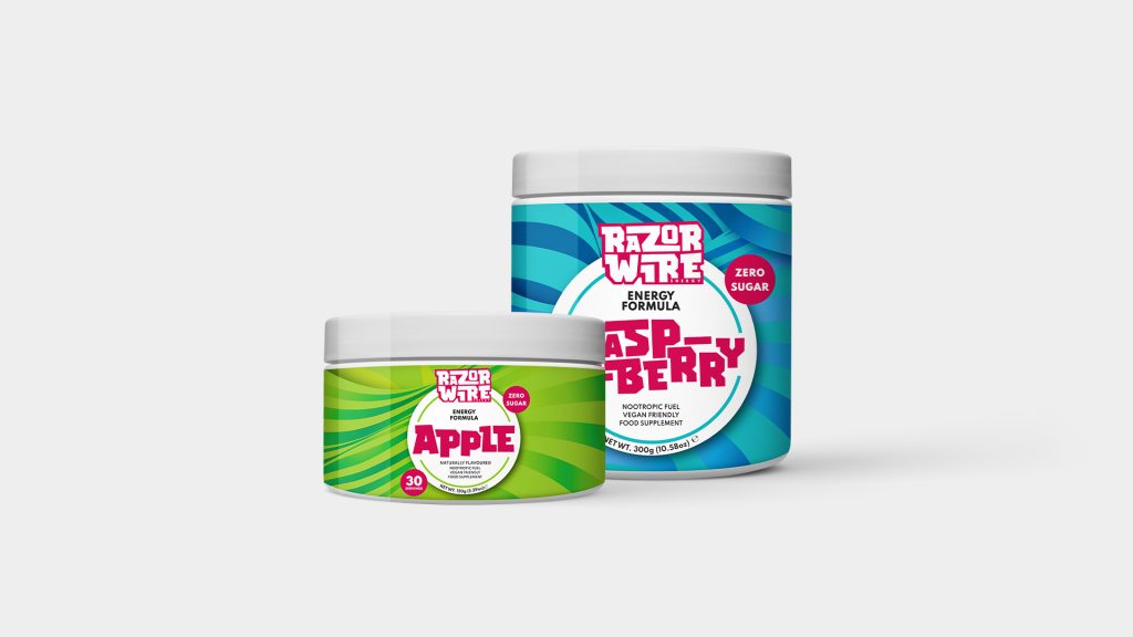
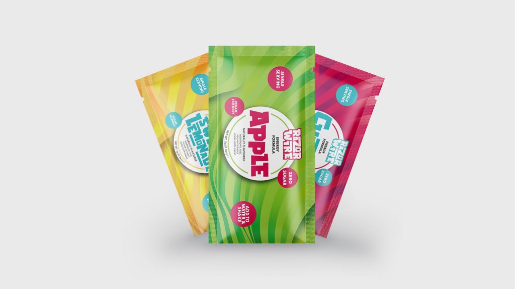
We were asked to create a brand that stood out from the likes of its competitors. From a whole rebrand of the classic Razorwire logo to a new, spruced-up brand image that you’d instantly spot on the shelf.
We designed a logo that just screams flavour – from the weird and wonderful typography to the bright and juicy colours picked out to perfectly complement one another.
Once the branding was complete, we started work on designing packaging for tubs, sachets and most recently, cans!
Delve into the strange, wonderful, and delicious drinks of Razorwire Energy – click here!