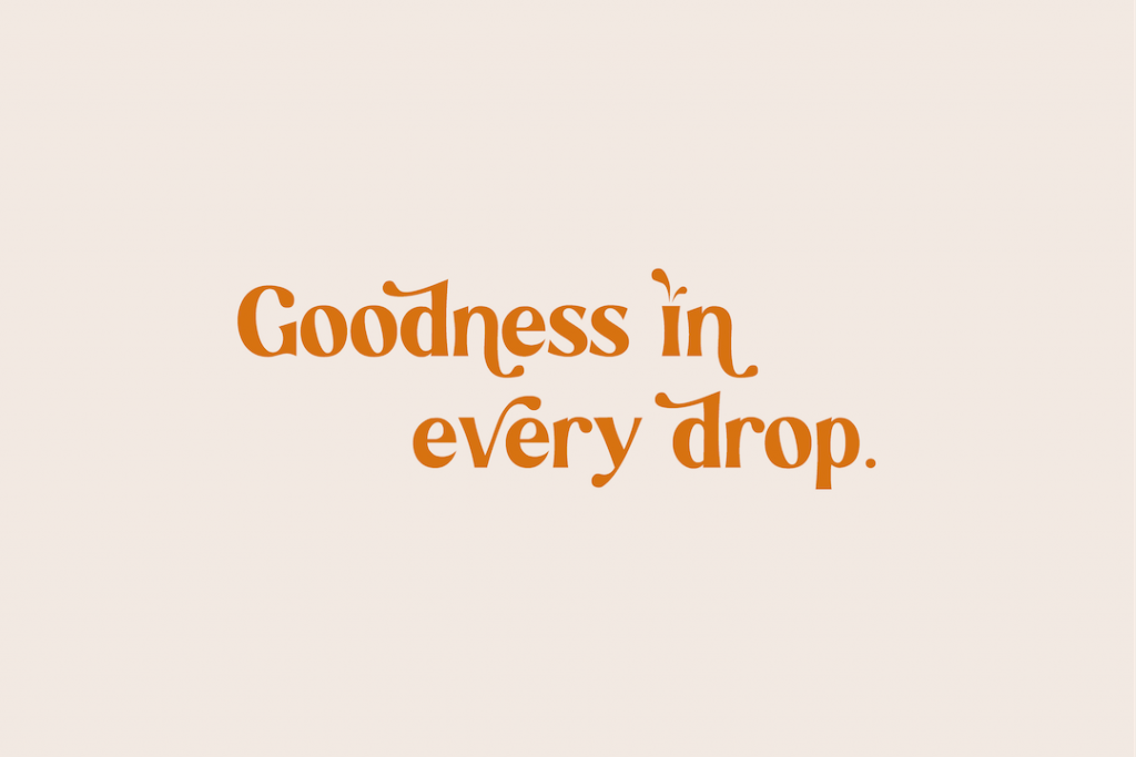
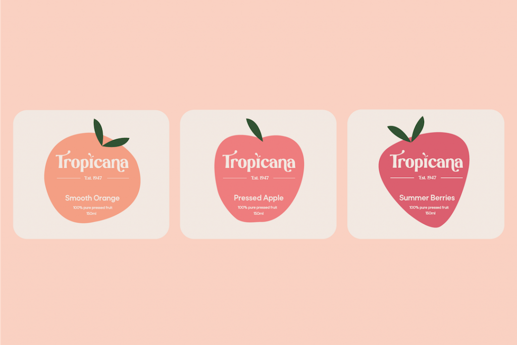
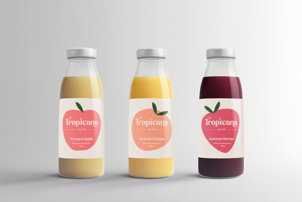
After looking at Tropicana’s branding, and what their competitors were doing, I wanted to approach this brief with a completely fresh idea. The visual I was trying to achieve was on the more minimal side, based around clean shapes, interesting typography, and a subtle yet pleasing colour palette.
How can we help you?

