
When designing anything from a print publication, to a logo or to an advert, there’s going to be many elements that are carefully considered to create those designs. For example the layout, colour palette and visual imagery are all examples of tools used within design to provoke an emotion and display a message.
Unfortunately, fonts are often overlooked when it comes to design, and have much more impact than you may initially think. They are a powerful tool that can be used to convey a broad spectrum of feelings within your audience. Therefore, fonts should always be carefully selected to convey the intended message.
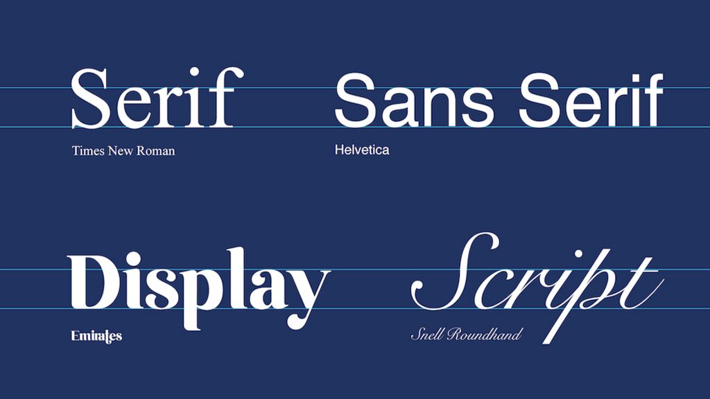
So, what are the different types of fonts and how do they make us feel?
Serif – A serif font, believe it or not, has small features called “serifs” attached to the end of lines or strokes. Some common serif typefaces that are broadly used are Times New Roman, Georgia, and Garamond. This style is primarily received by its audience as feeling traditional, respectable and sophisticated.
Sans Serif – A sans serif font is the direct opposite of a serif font. Sans is a French word that literally means – without. Therefore, a sans serif font is without any serifs attached to its letters. A few sans serif typefaces that are commonly used are Helvetica, Arial and Gill Sans. This style is predominantly received as clean, minimal and modern.
Script – Script fonts are based on the fluid strokes of handwriting. They can vary in style from elegantly calligraphic, to more a more casual brush-like style. The type of script font chosen will determine the tone of your design. For example, you may expect to see a calligraphy style font used on the label of a wine bottle as calligraphy promotes feelings of elegance and sophistication. Whereas a brush-like font may feel misplaced here as they are much more free and fun in their appearance. Brush fonts are often applied to children’s book covers, or can be used to liven up editorial design.
Display – Display fonts, similarly to script fonts, can vary hugely in their appearance. They can range from fun novelty fonts to heavy and impactful fonts. However they are designed to be used specifically for titles and headlines, as oppose to long form body text. This is because they are often either heavy in weight, decorative, or designed simply to draw attention, so should be used sparingly.
Some examples of well known display fonts are Broadway, Cooper Black and Stencil. These fonts are all very different in style, and again, will all provoke different emotions. Broadway for example was designed to evoke feelings of the 20’s and 30’s, therefore would feel appropriate applied to a book or album cover design from this era.
Font psychology summarised is the study of how fonts impact audiences thoughts, feelings and behaviours. So when it comes to applying fonts to branding, products, publications and so on, you should consider what your message is. Think to yourself, how will your audience perceive your font choice?


